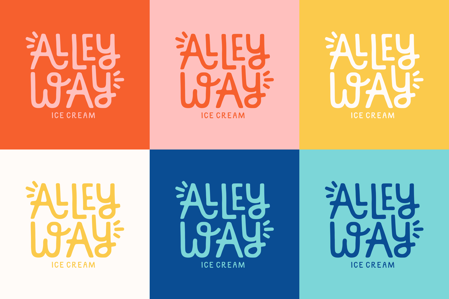
Alleyway Ice Cream
SKILLS / SCOPE
— Brand Discovery + Strategy
— Branding Identity Design
— Illustration + Pattern Design
— Packaging (Pint + Cup)
— Wayfinding Signage
Alleyway Ice Cream is a small-batch, homemade ice cream shop that can be found at the end of (you guessed it) an alleyway. This off-the-beaten-path location is matched with equally quirky flavors like Uber Heath Bar Crunch, Thai Tea Cookies & Cream, and Matcha Salted Pistachio. Since opening in Saugerties, NY in 2017, Alleyway has become a local staple and a roadtrip destination for many. It is guaranteed that you leave Alleyway with a full stomach, a happy heart, and new memories to cherish forever.
When the shop owner, Julian Hom, reached out, I immediately signed on to the project (insert dream client). My main goals were to:
Bring strategy and intentional to the visual identity to better showcase Alleyway’s quirky personality and fun flavor offerings
Develop more eye-catching wayfinding signage to help customers better locate his shop down the alley
Design an eye-catching pint to help Julian expand into wholesale and stand out in grocery store freezers throughout the Northeast
Logo Design
In the discovery phase of this project, I learned that Julian spends hundreds of hours perfecting each flavor whether it's a classic favorite like Vanilla or an unusual combo like Ube Heath Bar Crunch. It was clear to me that the logo system needed to make nods to this incredible attention to detail and homemade nature. I spent a long time working analog to capture this handmade feel – using the tried-and-true Sharpie and tracing paper.
The organic, imperfect, hand-drawn logo marks feel friendly and inviting, yet a little bit funky and fun. The jigsawed letters fit together like puzzle pieces to point to the connection and community that Alleyway creates. The flared / emphasis lines are meant to resemble bursts of excitement – an emotion that’s present before, during, and after an Alleyway experience. The ice cream cone – though a classic motif for ice cream shops – is made unique with the stacked 3 scoops as Julian believes in the more the merrier. Literally and figuratively, it points to the ideas of abundance and overflow.
Color Palette
Alleyway was made to stand out, not fit in — flavors and color palette alike. In keeping this important overarching sentiment in mind, I created a color palette that’s unconventionally bright and references the colors and names of his unique flavors over the years. Local and industry competitor research also showed me that a majority of brands stick to the neutral colors, so this became a good differentiator for Alleyway, both at the shop and on shelves.
The hand-drawn aspects of the brand didn’t just stop with the logos; I brought out my Sharpie and tracing paper again for the brand pattern which appeared on the pints and the cups. The bold pattern features important elements of the business all jigsawed together similar to the logo.
There was also a big opportunity for Alleyway to stand out with the lid design / color, as I noticed competitors weren’t really straying far from a black, white, or brand color for the lid. I brought in the stacked ice cream motif in Alleyways brand colors to further drive home the ideas of fun, different, and bold.
Packaging Design
I really enjoy when brands include surprise + delight moments throughout their branding and one way I did this for Alleyway was through “hidden” messaging on the pint. Julian and I worked collaboratively to write this messaging and came up with two lines:
“For Best Results, Eat Immediately” below the rim of the pint in the area that the lid covers (until opened)
“Open for Wow” arched on the top area of the lid
These small but mighty and relatable additions became an unexpected way to further connect with ice cream lovers.
Signage Design
The alleyway is what makes this ice cream shop so unique, but it is also what makes it more tough to find. With the new signage design, I set out to design one that would be hard to miss. Instead of a generic circle or square sign, we went with the organic half circle “scoop” shape in the red brand color (Thai Tea Cookies + Cream). We strategically increased the size of “Ice Cream” and added a directional arrow to further guide people.
Signage, close-up.
Signage, in context of other street signs.
Social Media
Alleyway’s main form of marketing is via Instagram so it was important that at first glance, the feed was eye-catching. For the profile picture, I brought in the A lettermark with a red background to stand out and nod to appetite and excitement.
KIND WORDS FROM THE FOUNDER
“Natalie's passion and expertise is exactly what Alleyway needed to help us reach the next level.”
— Julian Hom


