Here We Grow
SKILLS / SCOPE
— Brand Discovery + Strategy
— Brand Identity Design
— Social Media & Blog Templates
— Illustration
Here We Grow is an inclusive online educational community and service-based business led by Kira Bender. Kira is both a mother and pediatric occupational therapist who cultivated a following through this valuable POV. Moms don’t always know what to expect or do when it comes to parenthood, so Kira uses her online platforms to normalize and educate with bite-size tips and advice.
Kira reached out looking for me to better define her business and design cohesive branding. She wanted her visual language to better speak to how her business is friendly, innovative, inclusive, playful, fun, and wanted to position herself as a knowledgeable resource. While working together, Kira shared info primarily on Instagram and her blog, but her long-term business goals included creating an online course, offering 1:1 and group consulting for parents, businesses, schools, and organizations.
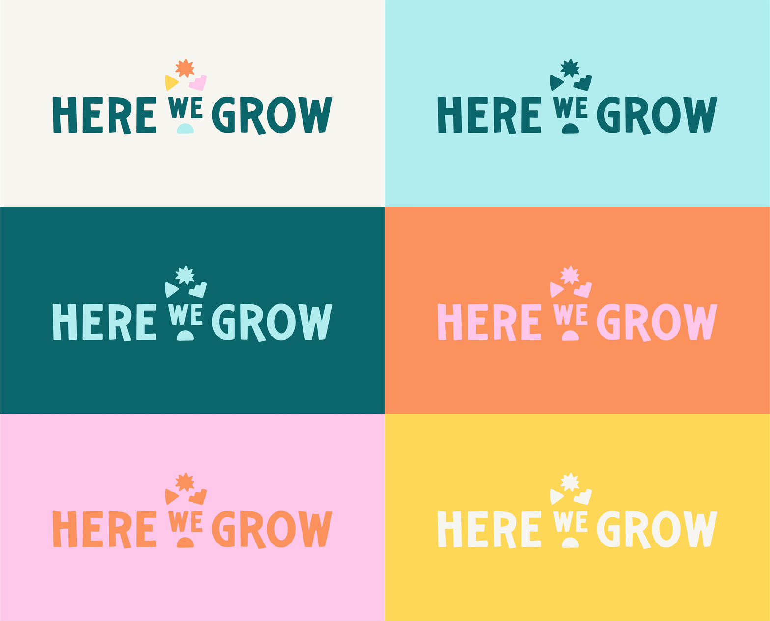
Taking into account what I learned during our discovery phase, I designed a logo suite that is playful, approachable, family-oriented, and most importantly, ownable. Kira’s one main request for me was to incorporate hand-drawn elements to nod to the imperfect, messy, and hands-on journey of parenthood. The hand-tweaked sans-serif wordmark paired with the hand-drawn shapes both deliver on her request bring a personal and inviting touch.
The specific brand shapes hold a lot of meaning for Here We Grow, split up into primary and secondary shapes. These shapes support the logo suite while also coming in handy later in the identity to help differentiate (i.e. blog topics).
Logo Design
Color Palette
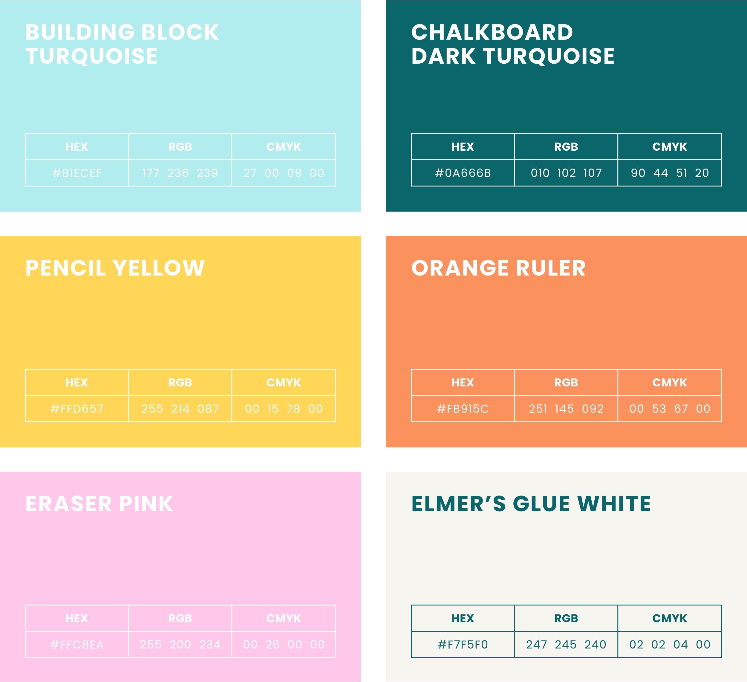
Since Here We Grow is essentially an online learning community for parents, the bright color palette and custom color names are a nod to school classrooms that are typically colorful, fun and welcoming. Turquoise, made up of blue, green and yellow, is featured to evoke a sense of trust (blue) while also bringing in feelings of growth and happiness (green and yellow). Yellow and orange bring in that happy, joyful, and playful energy while the pink brings in warmth, creativity, and youthfulness. White brings a sense of peace and new beginnings.
With Here We Grow’s community showing up digitally (via her website and social media), it was imperative that I set Kira up with a website and templates that reflected her new branding and brought cohesiveness to her digital presence. I delivered website mocks, Instagram Post and Story templates, Instagram Highlights, Blog post templates and a Facebook cover design.
Digital Applications


While Here We Grow’s presence is mainly digital, there are occasions where a printed business card comes in handy.
Print Applications
KIND WORDS FROM THE FOUNDER
“Natalie's personality shines through in her work. She knew exactly how to bring my ideas to life! I couldn't be happier with my rebrand!”
— Kira Bender


